PantryOne.
Mobile app · Food & groceries
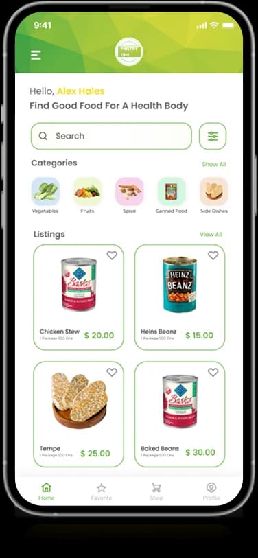
A grocery-shopping interface with food categories, product cards, cart controls, and a personal account area.
A pantry of choices, close at hand.
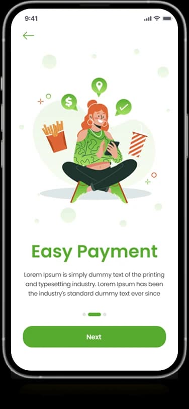
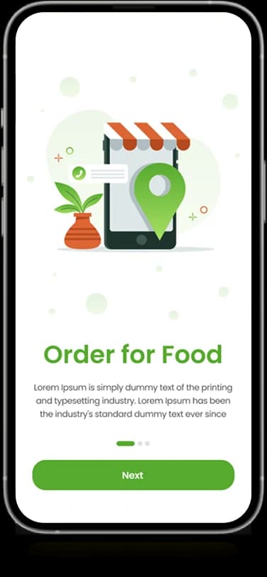
PantryOne’s mobile artwork introduces food ordering through a bright green storefront. Category tiles and product cards lead the shopping interface, while account and sign-in screens support the surrounding journey. Product images remain the main visual language throughout the supplied layouts.
What it does
A grocery-shopping presentation that places illustrated food categories, product imagery, and compact shopping controls in a fresh green interface.
Food categories
Illustrated tiles group the grocery catalog.
Product cards
Individual items combine product imagery and short information.
Shopping controls
Cart-oriented actions appear within the product experience.
Customer account
A personal details screen organizes account information.
How people use it
The original PantryOne screens introduce food ordering before a more detailed view of grocery categories and items.
- 01
Meet the storefront
Illustrated introductory screens establish the grocery and food-ordering context.
- 02
Explore the categories
Small food illustrations divide the catalog into recognizable groups above the product area.
- 03
Inspect the items
Product cards combine an image, short displayed details, and nearby shopping-oriented controls.
Make a small grocery catalog feel easy to scan.
Many products compete for attention in a mobile storefront. PantryOne uses recognizable category imagery and repeated product cards to establish a clear order between browsing groups and individual items.
Recognizable food groups
Illustrated category choices provide compact, visual browsing destinations.
A repeated product pattern
Consistent image and information positions help distinguish one grocery item from the next.
A fresh, contained frame
Green accents and white panels keep the shopping content visually connected to the introduction.
How it's put together
Design direction
Fresh green and white frame a modular shopping interface. Small category illustrations create clear entry points, and compact product cards combine imagery with information and controls. Rounded containers soften the more detailed catalog views.
Technical perspective
Categories and items at different information levels.
The interface separates category navigation from individual product cards and account-oriented areas. Product imagery, short labels, and visible controls sit within repeated modules, giving the catalog a consistent structure across the supplied screens.
Inside PantryOne
Select any screen for a closer look.
Planning something similar?
Creating a grocery storefront? Let's give categories, products, and shopping decisions a clear mobile order.
Get a free consultation
Tell us what you need. A senior engineer replies within one working day.