Dateflow.
Mobile app · Dating & profiles
A dating-oriented mobile presentation with profile cards, personal details, preferences, and account entry.
An introduction built around people.
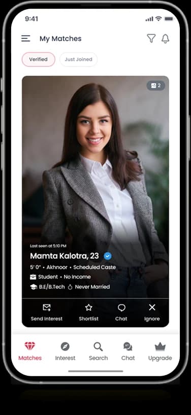
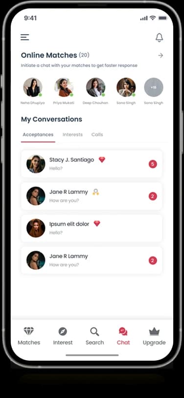
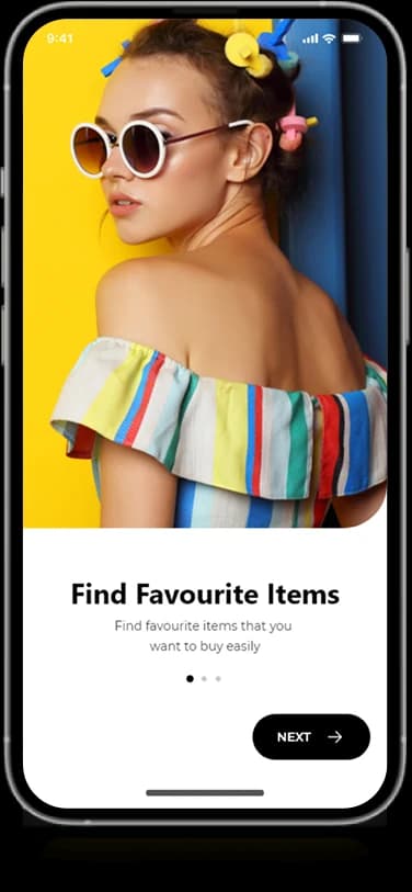
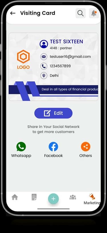
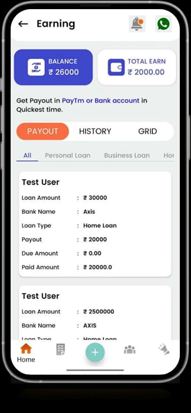
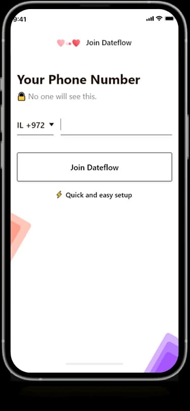
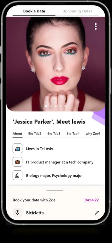
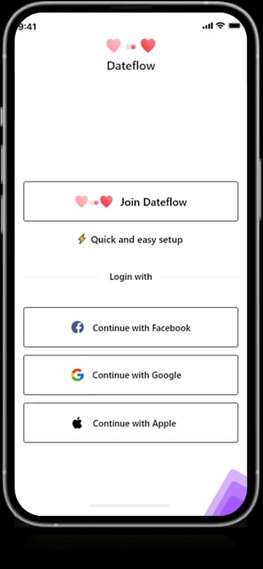
Dateflow’s original screens combine a light account introduction with phone entry, portrait-led profile information, and community guidance. Alternative entry choices are grouped on the welcome screen, while a separate phone view gives one input a focused setting. The profile layouts then shift attention to imagery and the personal details displayed about an individual.
What it does
A dating-oriented introduction with account choices, phone entry, detailed profile information, and community guidance.
Profile context
Portrait-led views pair personal imagery with structured information.
Entry choices
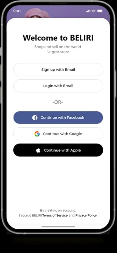
The welcome screen groups the account and sign-in options shown in the design.
Phone input
A dedicated mobile-number view gives account entry a focused information step.
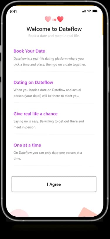
Introductory guidance
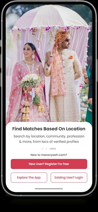
A separate screen provides supporting context for the people-oriented experience.
How people use it
Dateflow's supplied screens establish account entry and personal context before the profile-led experience.
- 01
Choose an entry route
The introductory screen groups the account and sign-in choices within a light branded layout.
- 02
Provide the account detail
The phone-entry view gives one piece of information a focused screen and a prominent continuation action.
- 03
Explore the personal context
Profile imagery, displayed details, and introductory guidance explain the people-oriented setting.
Make personal introductions feel structured.
A dating interface balances portrait-led presentation with more detailed personal choices. Dateflow separates these information levels instead of asking one screen to carry the full introduction.
Entry choices in one place
The welcome view gives alternative account routes a consistent visual treatment.
Focused input steps
A dedicated phone screen narrows the attention to one account detail.
Profiles with supporting context
Large imagery is paired with structured personal information rather than standing alone.
How it's put together
Design direction
Coral, pink, and soft white surfaces create a warm visual identity. Portrait cards occupy large areas of the discovery view, while labeled rows and simple input controls support the more detailed profile and onboarding screens.
Technical perspective
Account entry and profile information states.
The visible architecture uses distinct welcome, input, profile, and guidance screens. Light surfaces and recurring coral accents maintain continuity while the content changes from a small form to a portrait and its associated personal details.
Inside Dateflow
Select any screen for a closer look.
Planning something similar?
Creating a people-focused app? Let's make its introduction, account choices, and profile information feel coherent.
Get a free consultation
Tell us what you need. A senior engineer replies within one working day.