KegelKlock.
Mobile app · Exercise routines
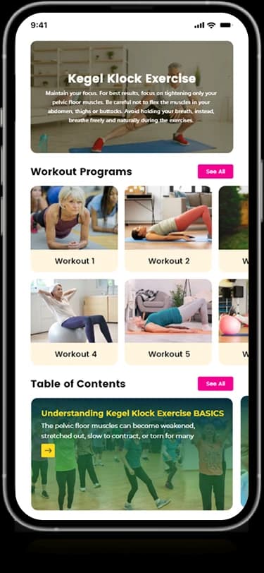
KegelKlock’s mobile interface presents exercise choices, timing views, a calendar, and progress graphics.
Give the routine a clear visual rhythm.
The KegelKlock mobile artwork combines exercise-oriented cards with a timer and calendar. Progress graphics provide a separate summary surface, while entry screens introduce the program. The presentation describes the supplied routine interface without asserting clinical benefits or adherence results.
What it does
An exercise-program interface with routine cards, timing views, audio-related settings, and subscription information.
Exercise choices
Colored cards introduce different routine options.
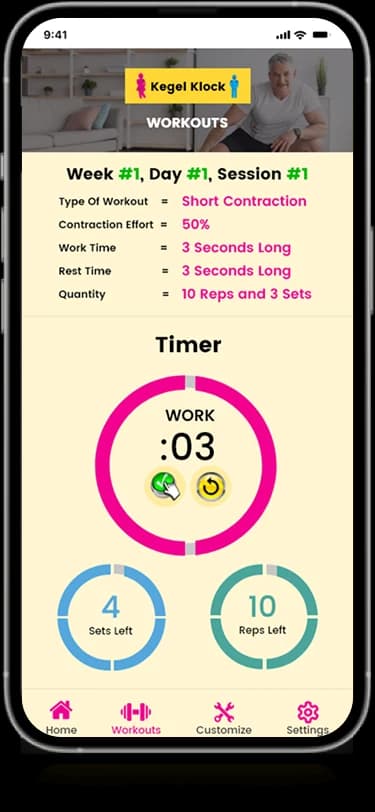
Timer view
A circular timing interface appears in the screen collection.
Calendar
Date-based information provides a view of the routine over time.
Progress graphics
Visual indicators summarize the activity shown in the artwork.
How people use it
The KegelKlock mobile designs connect program discovery with a focused routine and its visible configuration options.
- 01
Explore a program
The home view groups exercise and program information into illustrated cards.
- 02
Review the routine view
A prominent circular timer gives the exercise-oriented screen a clear visual center.
- 03
Adjust the displayed choices
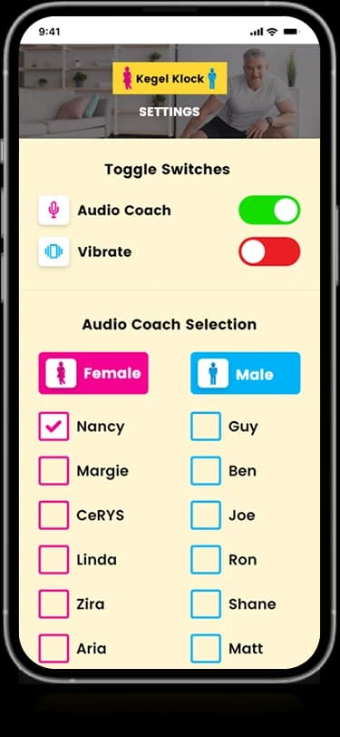
Settings-style controls group the audio and preference options shown alongside the routine screens.
Give an exercise routine a clear visual center.
Program discovery and a timed exercise need different screen priorities. KegelKlock uses cards for the broader offering and a larger circular control for the focused routine view.
Programs in recognizable groups
Illustrated cards separate the available exercise-oriented information.
Timing as the focal point
The circular graphic distinguishes the routine view from the more detailed content screens.
Preferences with grouping
Related toggles and selections share a contained configuration surface.
How it's put together
Design direction
Yellow gives the product a recognizable identity across both web and app. Bright exercise cards and circular graphics establish a visual rhythm, with white panels keeping calendar and account details readable.
Technical perspective
Program content and routine configuration.
The visible interface includes program cards, a timing surface, preference controls, and subscription information. Those distinct states describe the interaction design without establishing clinical effectiveness, background timer behavior, or payment implementation.
Inside KegelKlock
Select any screen for a closer look.
Planning something similar?
Designing a routine-based wellbeing product? Let's give its content, timing, and preferences a clear visual rhythm.
Get a free consultation
Tell us what you need. A senior engineer replies within one working day.