Heartsync.
Mobile app · Relationships & reflection
A relationship-themed mobile presentation using mood choices, reflection prompts, personal indicators, and account screens.
Make space for small moments.
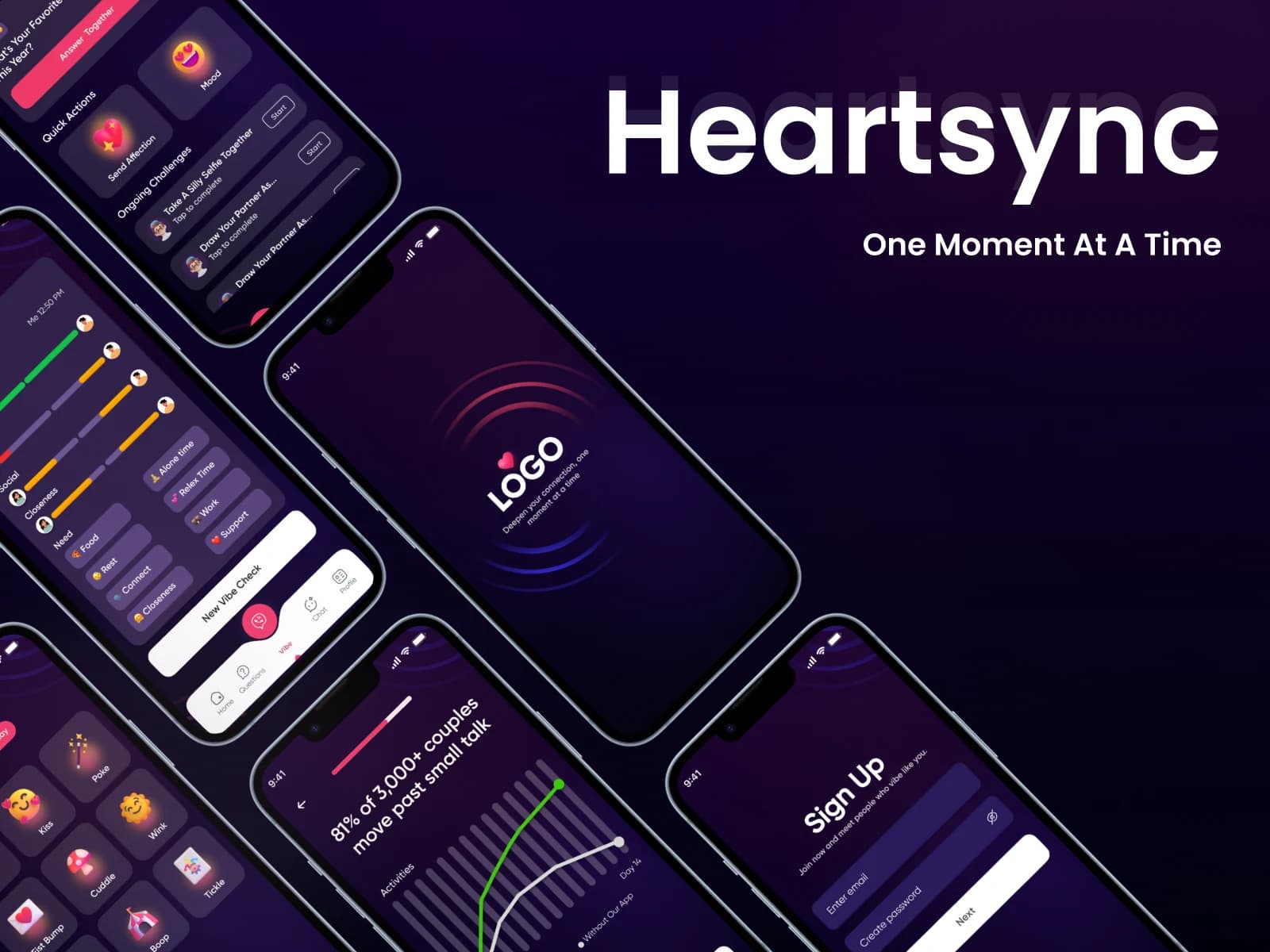
Heartsync’s supplied artwork presents a relationship-oriented experience with emotion choices and reflective information. Dark screens connect mood-style inputs with personal indicators and introductory content. Only Heartsync-branded graphics are used here; the GoBroker screenshots embedded in the legacy page are excluded.
What it does
A reflection-oriented interface with expressive emotion choices, personal sliders, relationship prompts, and introductory account screens.
Emotion choices
Expressive icons provide a visual selection surface.
Reflection prompts
Prompt-like cards introduce relationship-oriented content.
Personal indicators
Colored sliders and graphics organize the displayed information.
Account entry
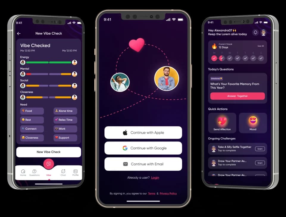
Sign-up and introductory screens share the darker identity.
How people use it
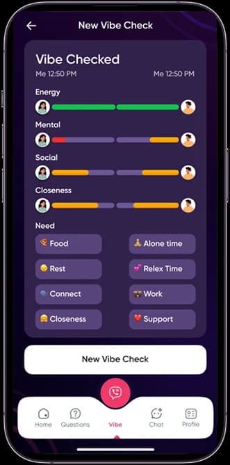
Heartsync's purple compositions connect a personal check-in with the more detailed indicators displayed in the reflective workspace.
- 01
Begin with an emotion
Expressive choices give the personal check-in a visual entry point.
- 02
Review the indicators
Colored sliders and labeled areas organize the information displayed in the reflection-oriented screen.
- 03
Explore a prompt
Rounded cards give relationship-themed questions and reflective content their own supporting surface.
Make a personal check-in visually approachable.
Reflective information can feel dense when every input is presented as a form. Heartsync uses expressive choices and color-coded indicators to create different visual entry points within a dark interface.
Expression before detail
Emotion-style icons introduce a more personal alternative to a text-only opening.
Indicators with visual distinction
Separate colors help distinguish the labeled sliders shown in the workspace.
Prompts in smaller cards
Rounded boundaries break reflective content into manageable sections.
How it's put together
Design direction
Deep purple and near-black surfaces support bright pink, orange, and green highlights. Emoji-like choices and colorful sliders introduce expression into the interface, while rounded cards divide the more detailed reflective content.
Technical perspective
Expressive input and indicator presentation.
The source shows emotion choices, slider-style inputs, reflective prompts, and account entry. These describe a personal interface pattern rather than verified psychological assessment, relationship scoring, therapeutic advice, or measured wellbeing outcomes.
Inside Heartsync
Select any screen for a closer look.
Planning something similar?
Creating a reflective digital experience? Let's give personal choices a clear, thoughtful visual language.
Get a free consultation
Tell us what you need. A senior engineer replies within one working day.