Kegelklock.
Web platform · Exercise & wellbeing
A program website introducing KegelKlock’s exercise offering through information, courses, and membership navigation.
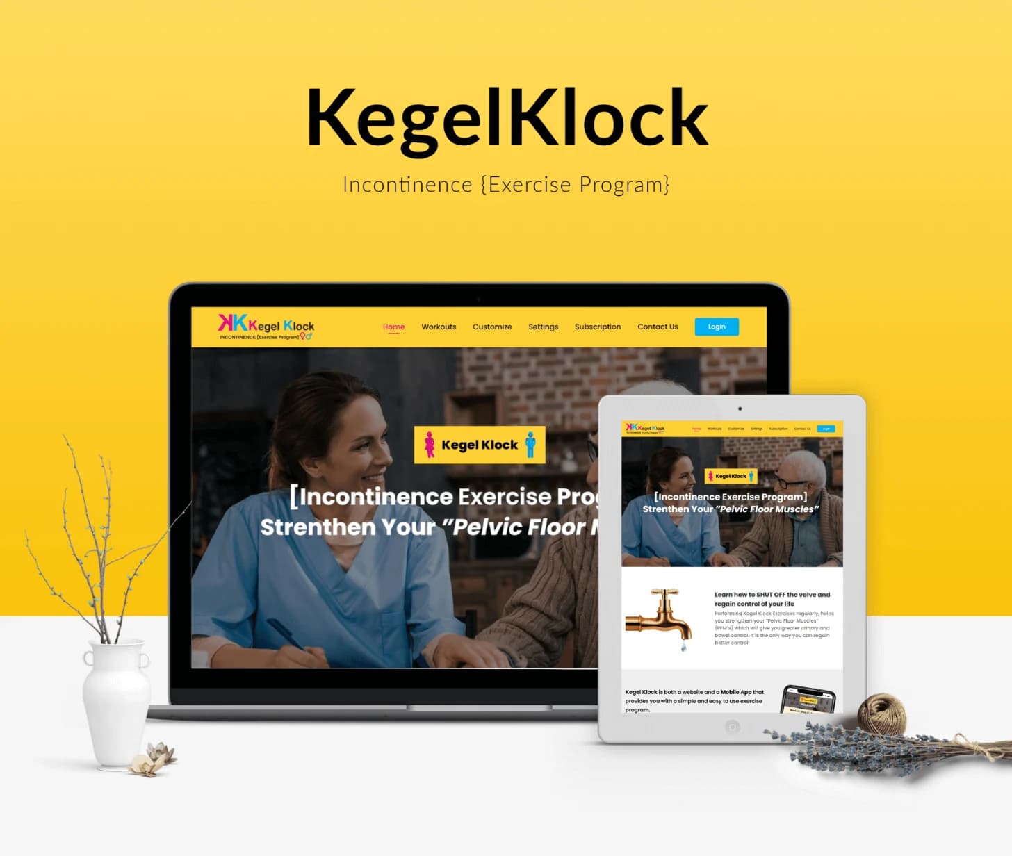
A focused home for an exercise program.
KegelKlock’s website artwork introduces an incontinence exercise program and pelvic-floor exercise content. The interface includes navigation for information, courses, settings, and subscription areas. This presentation describes the visible program and interface without making medical-effectiveness claims.
What it does
An exercise-program website with explanatory content, course navigation, and clearly separated membership information.
Program introduction
The landing page introduces the exercise program and its subject.
Course navigation
A dedicated route appears for course-related content.
Membership areas
Subscription and account-oriented navigation are visible in the designs.
Program information
Supporting sections provide space for explaining the offering.
How people use it
The original website introduces the program before its course and subscription-oriented information.
- 01
Learn about the program
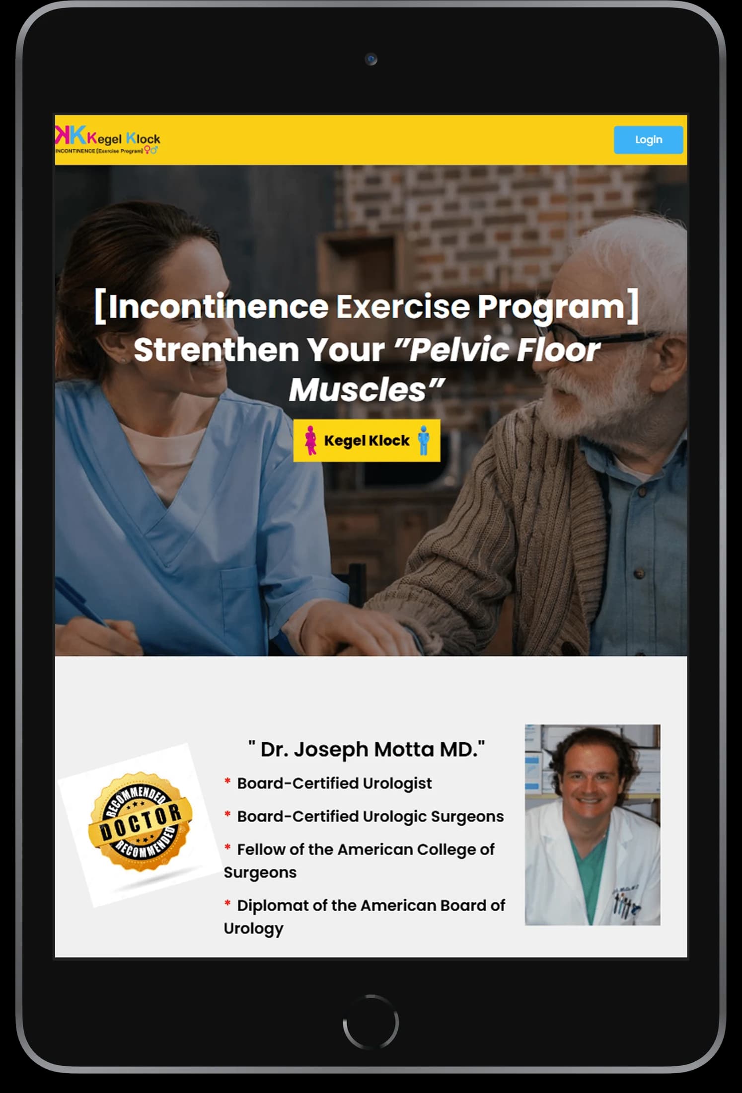
The landing page introduces the exercise subject through a direct headline and supporting information.
- 02
Explore course content
Course navigation provides a visible route toward the program's exercise-oriented material.
- 03
Review membership information
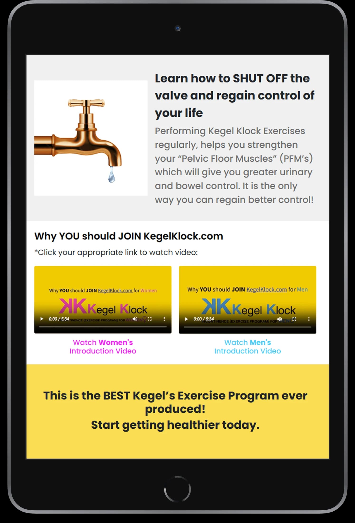
Dedicated subscription panels present the membership-related information shown in the artwork.
Separate program information from the next decision.
An exercise website has to explain its subject while making courses and membership easy to find. KegelKlock uses a recognizable yellow identity to connect these different information levels.
A clear program introduction
The opening content establishes the exercise subject before the more detailed website sections.
Named course navigation
A visible course destination keeps the program material distinct from general information.
Contained membership panels
Subscription-oriented content appears in its own grouped presentation.
How it's put together
Design direction
Yellow is the dominant brand color, paired with white content and lifestyle photography. The website uses a direct introductory headline followed by explanatory sections, keeping program information visually connected to the brand.
Technical perspective
Program, course, and membership surfaces.
The interface separates explanatory pages, course-related navigation, and account or subscription areas. These visible patterns do not establish a billing provider, exercise-prescription system, or clinical effectiveness, none of which is claimed here.
Inside Kegelklock
Select any screen for a closer look.
Planning something similar?
Presenting a wellbeing program? Let's organize the information and routine experience with clarity and care.
Get a free consultation
Tell us what you need. A senior engineer replies within one working day.