Examined Life.
Mobile app · Wellbeing & reflection
The artwork listed under Supplement Management is branded Examined Life and presents a calm, reflection-oriented mobile experience.

A quieter space for a personal check-in.
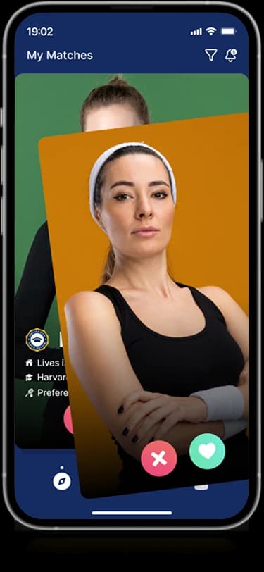
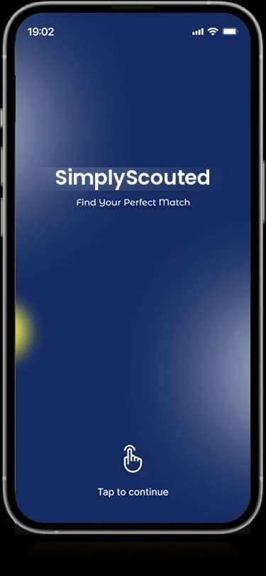
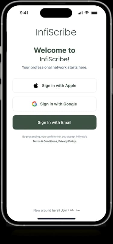
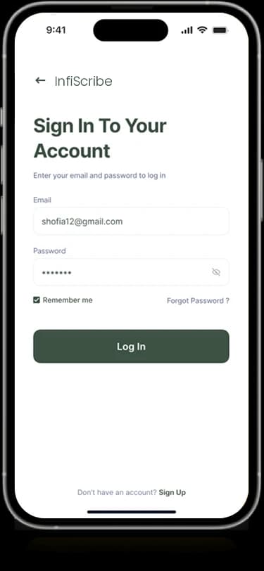
Clarigo’s original Supplement Management card uses artwork headed Examined Life. Its visible screens contain personal questions, introductory prompts, and account-entry layouts. This page preserves that source association and describes what is visible rather than recasting the artwork as a supplement-tracking product.
Listed as Supplement Management in the original archive; the supplied image is branded Examined Life. No separate supplement application assets were available.
What it does
Examined Life's original composition presents guided personal questions, calm introductory screens, and a focused account-entry experience.
Personal prompts
Question-based screens introduce a reflective interaction pattern.
Guided introduction
Short panels provide a staged entry into the experience.
Account entry
Labeled fields and clear actions establish the sign-in views.
Calm visual system
Muted colors and open layouts connect the supplied mobile screens.

How people use it
The artwork is preserved under its original Supplement Management archive route, while this narrative follows the visible Examined Life experience.
- 01
Meet the introduction
Soft green and cream surfaces introduce the reflective tone of the supplied composition.
- 02
Consider a personal prompt
Short question-based screens give each displayed decision a contained area of attention.
- 03
Reach account entry
Simple fields and clear actions carry the same visual restraint into the sign-in presentation.
Give a personal question room to breathe.
A reflective interface needs attention on the individual prompt. Examined Life's composition uses short content groups and restrained colors so the supporting interface does not compete with the question.

One prompt with focus
Contained question screens separate individual decisions within the introduction.
A calm visual frame
Sage, cream, and dark text provide contrast without a dense decorative layer.
Simple account controls
Rounded fields and short actions preserve the visual tone beyond the introductory panels.
How it's put together
Design direction
Sage green, soft cream, and dark navy create a restrained visual language. Short prompts and generous space keep individual decisions in focus, while rounded fields and simple actions connect the introductory and sign-in screens.
Technical perspective
A staged prompt and account presentation.
The available composition establishes introductory prompts and account-entry layouts. It does not establish supplement tracking or a health-management implementation; the original archive label is retained as provenance rather than used to invent a different product.
Inside Examined Life
Select any screen for a closer look.
Planning something similar?
Developing a personal reflection product? Let's make its questions and first steps feel focused and considered.
Get a free consultation
Tell us what you need. A senior engineer replies within one working day.