TukioConnect.
Web platform · Organization & collaboration
An organization workspace with people lists, administrative navigation, and a dedicated account-entry experience.
Bring an organization into focus.
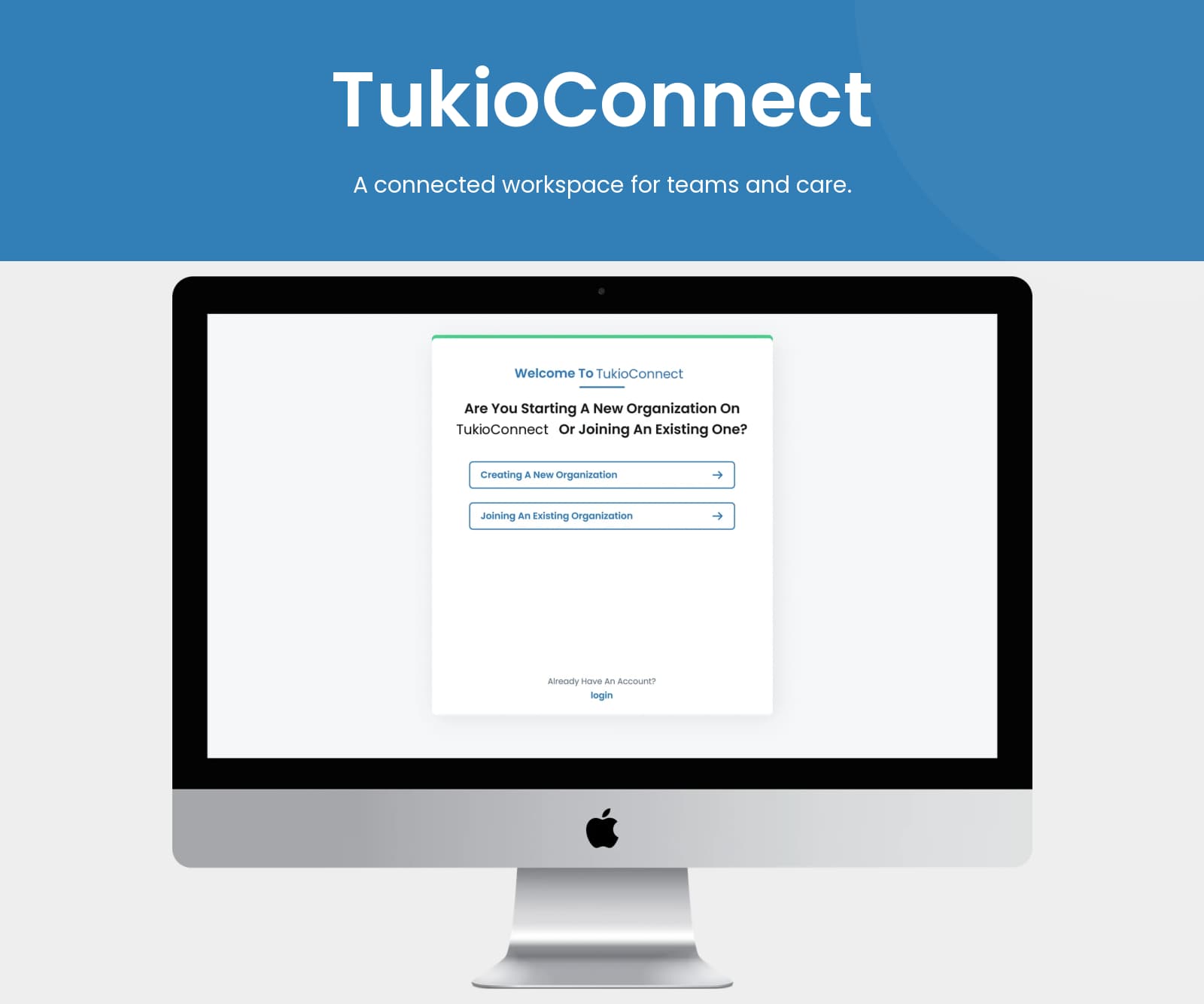
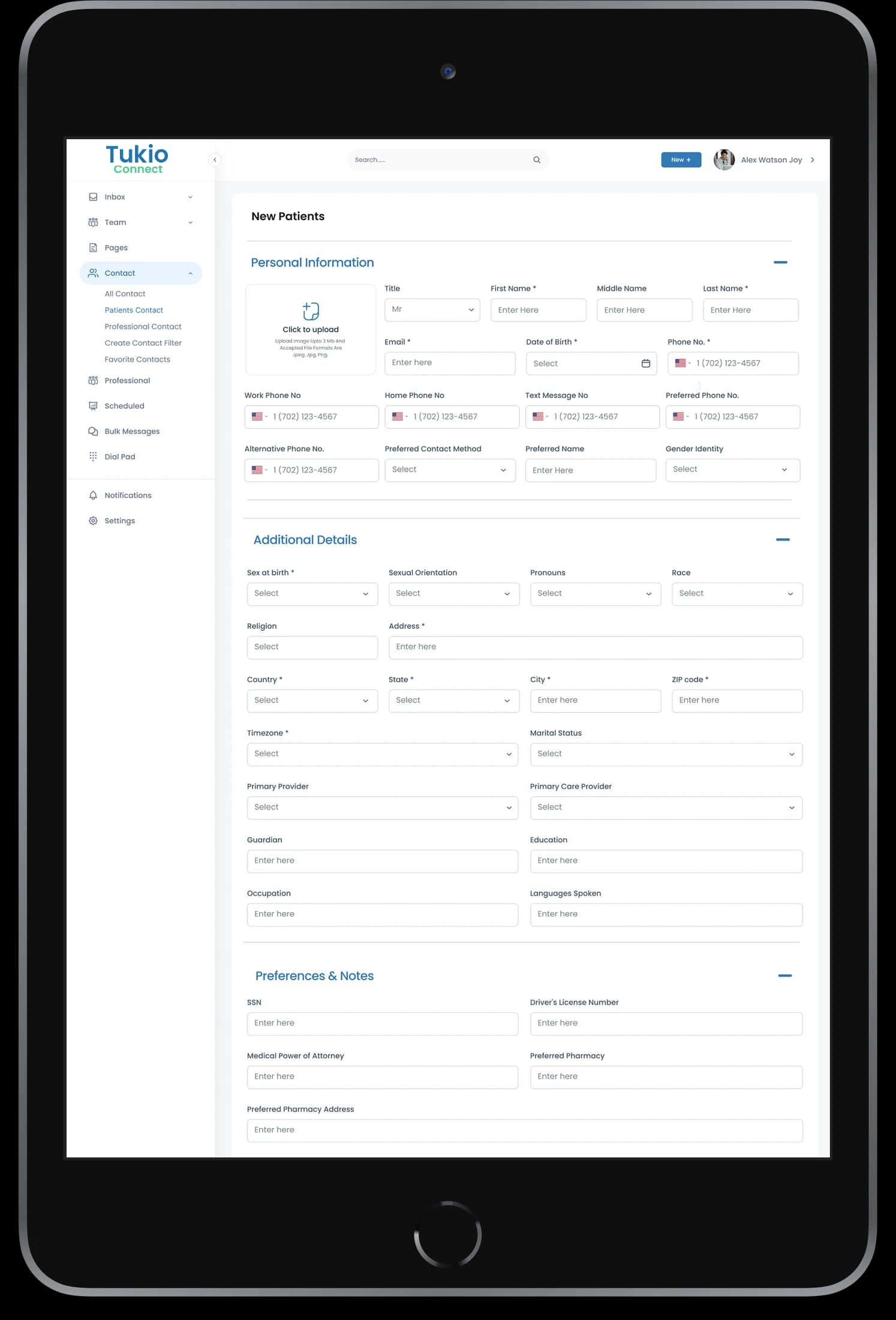
TukioConnect’s web artwork shows the distinction between starting an organization and joining an existing one. Inside the workspace, a persistent sidebar accompanies a structured people table. The interface places everyday organization information within reach of a single administrative view.
What it does
An organization workspace connecting people records, administrative navigation, and communication views within a restrained blue interface.
Organization entry
The presentation distinguishes creating and joining an organization.
People directory
A tabular view displays people and their associated information.
Workspace navigation
A sidebar groups the available administrative areas.
Account access
A focused sign-in screen provides a separate entry point.
How people use it
The web presentation pairs organization entry with a structured workspace for finding people and opening conversations.
- 01
Enter the workspace
The account presentation distinguishes starting an organization from joining an existing one.
- 02
Find a person
Use the structured directory and persistent sidebar to locate people within the organization.
- 03
Open a conversation
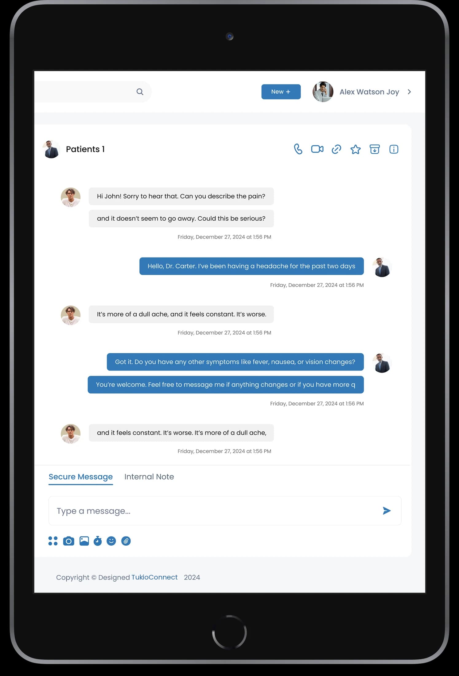
Dedicated conversation and calling layouts extend the people directory into a communication-focused workspace.
Keep people information and communication close.
Organization tools can become fragmented when directories and conversations feel like separate products. TukioConnect uses a shared navigation frame to connect these different working views.
A stable workspace rail
The sidebar gives directory, account, and communication areas a consistent position.
Scannable people records
Aligned rows and columns give detailed organizational information a clear reading order.
Focused conversation surfaces
Message and call views use simpler central panels within the same recognizable brand.
How it's put together
Design direction
Blue headings and actions anchor a mostly white interface. Compact rows, aligned columns, and a restrained sidebar support information-heavy screens, while the login presentation keeps the same identity in a simpler form.
Technical perspective
Distinct modules within one workspace.
The artwork separates organization entry, people records, messages, and call interfaces. Shared navigation and recurring identity elements connect these modules; the source does not identify a messaging provider or calling infrastructure.
Inside TukioConnect
Select any screen for a closer look.
Planning something similar?
Bringing an organization together? Let's connect the directory, daily tasks, and communication experience.
Get a free consultation
Tell us what you need. A senior engineer replies within one working day.