Whizora.
Web platform · Courses & learning
A learning website with course discovery, program cards, instructor-onboarding forms, and a teaching workspace.

Make the next course easy to discover.
Whizora connects a public course introduction with more structured educational working screens. Its artwork includes program cards, tutor-application steps, email-verification layouts, and a communication view. Purple and orange public-facing compositions sit alongside blue-accented workspace screens, showing how the same course brand changes its information density for different tasks.
What it does
A learning website spanning course discovery, program information, tutor application screens, and a teaching workspace.
Course discovery
The public website gives course exploration a prominent headline and entry action.
Program workspace
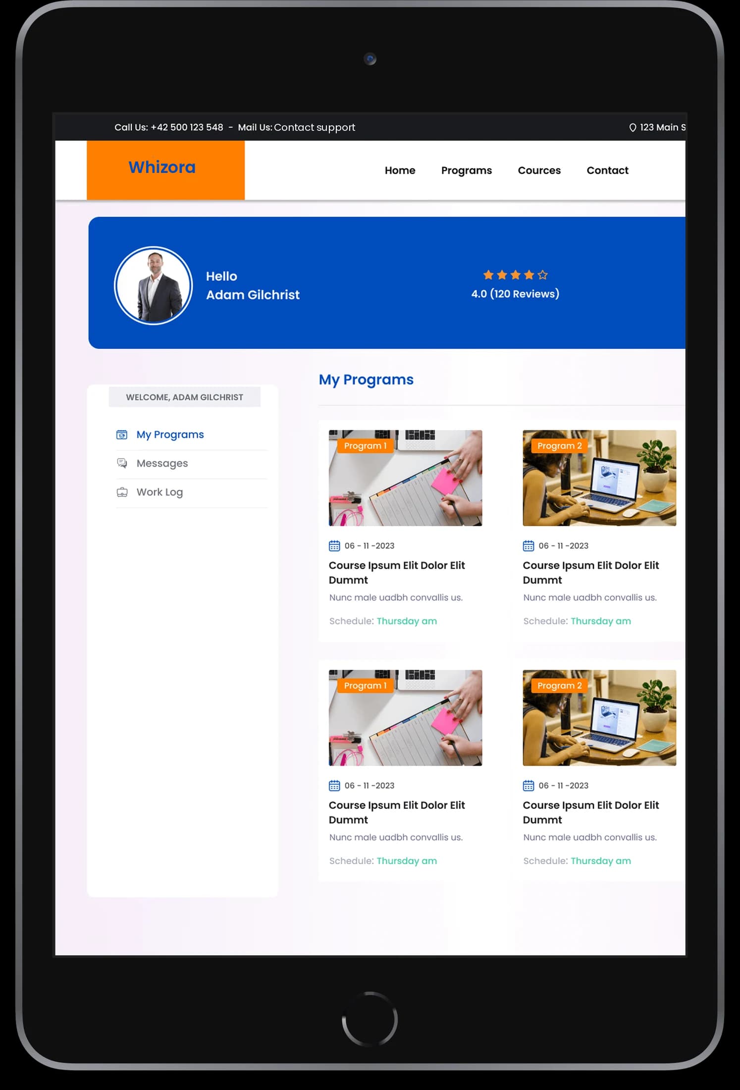
Repeated cards organize the educational programs shown in the account view.
Instructor application
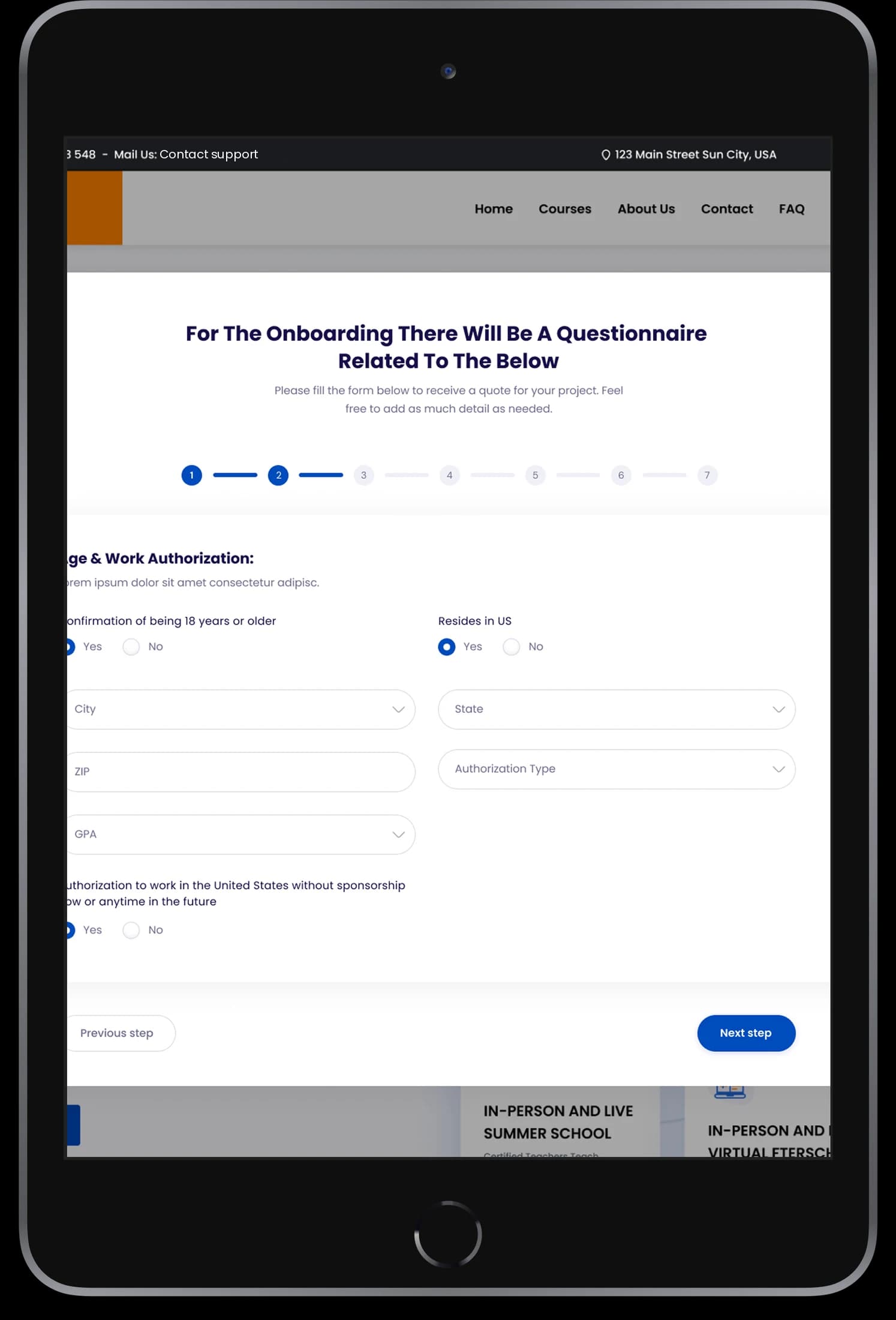
Staged forms present tutor information, supporting documents, and verification screens.
Communication view
A dedicated conversation layout appears within the same teaching-oriented workspace.
How people use it
Whizora's public introduction and instructor-oriented screens show different parts of the same education-focused experience.
- 01
Discover the courses
The public website introduces the learning offering through a prominent course message and educational imagery.
- 02
Explore program information
Program cards and account-oriented pages organize the more detailed learning content.
- 03
Follow instructor entry
Staged application and email-verification layouts introduce the tutor-onboarding journey shown in the supplied screens.
Connect course discovery with teaching operations.
A course brand needs a confident public introduction and more structured working screens. Whizora's designs adapt their information density while retaining recognizable navigation and accent colors.
Courses introduced clearly
The public hero gives the learning proposition a direct headline and visible entry action.
Programs as reusable cards
The account workspace groups course information into repeated visual modules.
Staged instructor forms
Application steps divide detailed onboarding information into smaller screens.
How it's put together
Design direction
The public introduction uses purple, orange, educational imagery, and a prominent course message. The workspace switches to light surfaces, blue panels, and repeated program cards. Staged application forms use progress indicators to divide more detailed instructor information into smaller screens.
Technical perspective
Public pages and staged onboarding.
The visible website includes course content, instructor application states, a program workspace, and communication layouts. These screens establish interface modules, without identifying a learning backend, verification provider, or class-delivery integration.
Inside Whizora
Select any screen for a closer look.
Planning something similar?
Connecting a learning brand with its working platform? Let's give each audience a clear path.
Get a free consultation
Tell us what you need. A senior engineer replies within one working day.