Qcop App.
Mobile app · Work records & documents
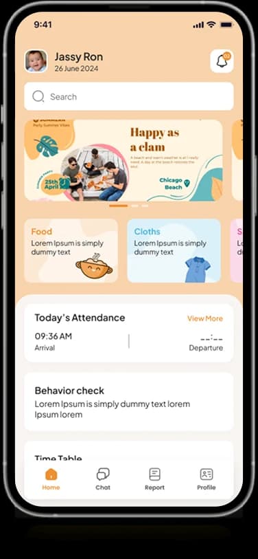
QCOP’s mobile artwork presents organized records, document imagery, summary information, and account access.
Bring field information into one interface.
QCOP’s supplied screens show a structured mobile workspace with record lists and image-based documents. Dashboard information and compact account views provide supporting context. The presentation emphasizes organizing work information rather than establishing a specific backend or compliance claim.
What it does
A structured mobile workspace combining summary modules, work-record views, filter fields, and a dedicated account entry.
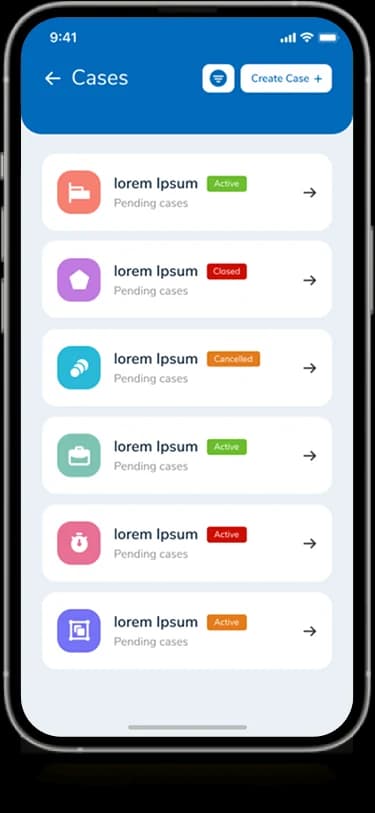
Record lists
Repeated rows group individual work-information entries.
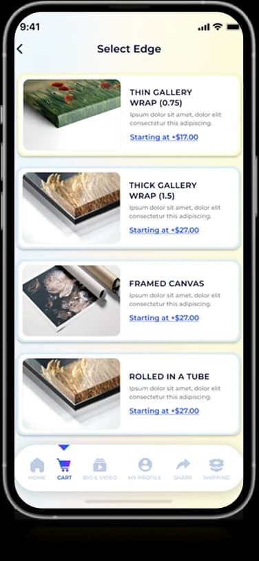
Document imagery
Document-style images appear in a dedicated content view.
Summary information
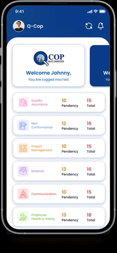
Small dashboard modules present a high-level interface.
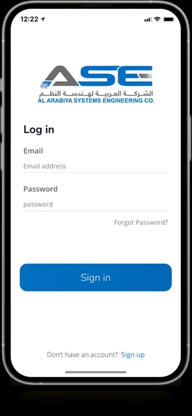
Account entry
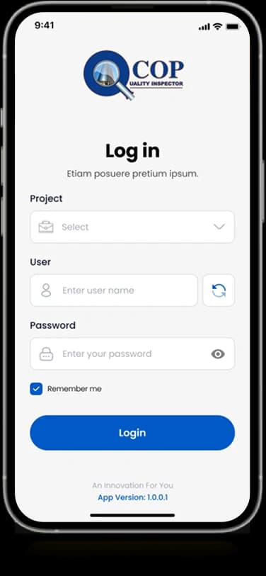
A focused login screen carries the QCOP identity.
How people use it
QCOP's supplied screens connect a high-level workspace with more detailed information and record-finding controls.
- 01
Enter the workspace
The branded login screen provides the account entry shown alongside the operating interface.
- 02
Review the summary
Compact dashboard modules group the main information areas into recognizable blocks.
- 03
Locate a record
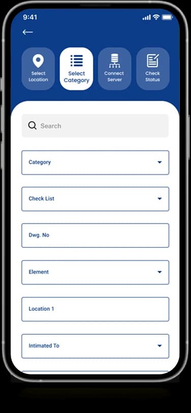
Search and grouped selection fields provide the visible controls for narrowing the record-oriented view.
Give dense work information a usable mobile order.
A work-record interface needs to show several information areas without becoming a wall of fields. QCOP separates a compact summary from the more detailed controls used to inspect records.
An overview in modules
Small, colored blocks provide distinct entry points into the displayed information.
Fields with grouping
Related selection controls form a deliberate sequence within the detail-oriented screen.
A consistent identity
Blue headers and repeated white panels connect account entry with working views.
How it's put together
Design direction
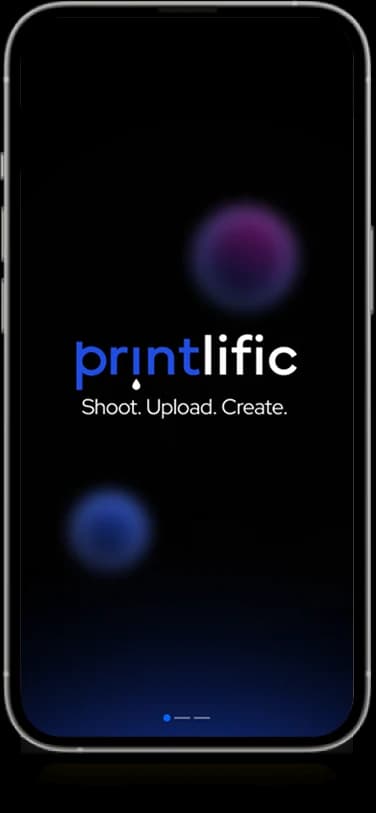
Navy and blue identify the product across splash, sign-in, and information screens. Compact rows and white content panels preserve density, with small colored indicators providing distinction inside the more detailed record views.
Technical perspective
Dashboard and record-finding patterns.
The screen set presents account access, dashboard modules, record information, and grouped filters. It does not disclose a compliance engine, document-processing system, record schema, or integration layer; the case study describes the visible workspace.
Inside Qcop App
Select any screen for a closer look.
Planning something similar?
Moving a work-record process to mobile? Let's create an overview that connects naturally to detailed information.
Get a free consultation
Tell us what you need. A senior engineer replies within one working day.