Law Legend.
Mobile app · Tax & learning content
A tax-themed learning interface with content categories, article-style information, and account screens.
Give knowledge a clear mobile structure.
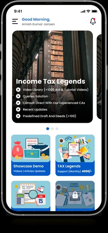
Law Legend’s supplied mobile presentation identifies an income-tax focus. Its home screen introduces content through banners and category tiles, while list views organize further reading. The case study follows those visible content patterns without treating the app’s material as verified legal or tax advice.
What it does
A tax-themed information home with learning categories, content entry points, and a structured personal account area.
Content home
A banner and content tiles introduce the available information.
Category browsing
Named categories organize different reading areas.
Information lists
Rows provide access to longer content entries.
Account screens
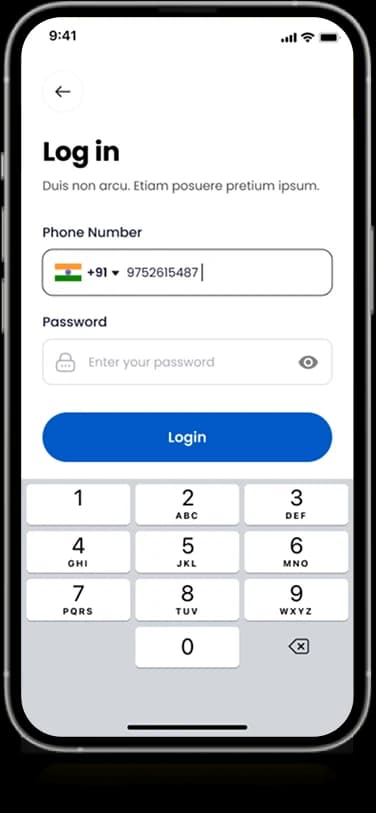
Branded entry and profile layouts support the personal interface.
How people use it
The original mobile layouts place content discovery before the longer reading and account-oriented surfaces.
- 01
Explore the content home
A prominent banner and illustrated tiles introduce the information areas within the app.
- 02
Choose a reading category
Distinct visual categories organize the tax-themed content into smaller browsing destinations.
- 03
Reach the account area
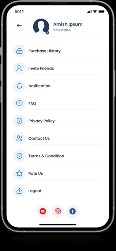
A separate menu groups personal information and supporting account-related destinations.
Make specialist content easier to navigate.
Tax-oriented material can look dense before reading begins. Law Legend's home uses illustrations and grouped destinations to give the content a clearer visual starting point.
A content-led opening
The introductory banner establishes the app's subject before the smaller navigation choices.
Categories with visual cues
Illustrated tiles separate reading areas without relying on a long text-only menu.
A quieter account menu
Personal and supporting destinations appear as a consistent list outside the main content home.
How it's put together
Design direction
Blue accents and bright category illustrations bring structure to a white interface. The design alternates between image-led discovery and more compact content lists, giving introductory browsing and focused reading different visual treatments.
Technical perspective
Content discovery and account navigation.
The visible structure distinguishes a content home, category routes, reading-oriented information, and an account menu. The case study does not verify the legal accuracy of content, a publishing backend, purchase handling, or membership enforcement.
Inside Law Legend
Select any screen for a closer look.
Planning something similar?
Presenting specialist learning material? Let's give readers a clearer way to discover and navigate its subjects.
Get a free consultation
Tell us what you need. A senior engineer replies within one working day.