Bubble.
Mobile app · Dining offers & rewards
A dining-and-rewards app presentation with coupon discovery, a points-oriented home, contact views, and QR-related imagery.
Connect a good offer with a clear next view.
Bubble’s original artwork combines a rewards-oriented home with dining offers, coupon lists, and contact-related views. Food photography and category choices introduce discovery, while repeated offer rows provide a more focused coupon surface. The supplied people and QR compositions add other interface patterns without establishing payment processing, redemption rules, or transfer operation.
What it does
A dining-and-rewards interface with offer discovery, coupon lists, a points-oriented home, and contact-related views.
Reward summary
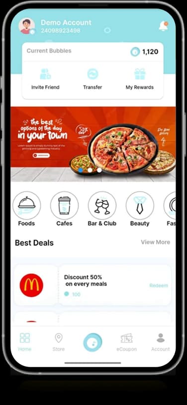
The home layout gives displayed points information a separate summary area.
Coupon discovery
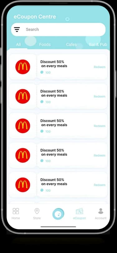
Offer-oriented lists organize individual promotions beneath search controls.
Contact views
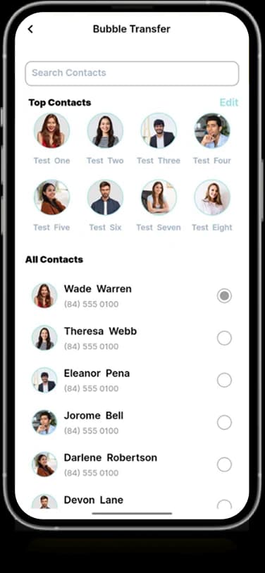
Portraits and short details appear in people and transfer-oriented interfaces.
QR composition
Original artwork includes QR-related imagery within the same product family.
How people use it
Bubble's original screens connect food and lifestyle offers with reward information and people-oriented transfer interfaces.
- 01
Explore the home
The opening workspace pairs displayed reward information with food imagery and category choices.
- 02
Browse the offers
The coupon-oriented list presents individual offers in repeated rows beneath a search area.
- 03
Find a contact
A dedicated people view organizes contacts for the transfer-oriented interface shown in the artwork.
Keep offers, rewards, and people distinguishable.
A rewards product can contain several different browsing tasks. Bubble gives promotional content, coupon records, and contact lists separate surfaces within a consistent aqua visual identity.
A clear home summary
The displayed reward balance occupies a distinct area above the promotional content.
Offers with repetition
Coupon cards use similar information positions for a more predictable browsing pattern.
People in their own view
Contact portraits and short details are grouped outside the offer-discovery surface.
How it's put together
Design direction
Aqua and white establish a light identity, with warm promotional imagery providing contrast. The displayed points summary sits above the discovery content, while coupon rows and contact lists use quieter, repeated layouts suited to more detailed browsing.
Technical perspective
Offer catalogs and contact-oriented states.
The original screens show a reward summary, promotional categories, coupon entries, contacts, and QR-related imagery. They establish the interface structure, while redemption rules, payment processing, points valuation, and transfer execution remain unverified.
Inside Bubble
Select any screen for a closer look.
Planning something similar?
Creating an offers or rewards experience? Let's connect the content while keeping each task easy to recognize.
Get a free consultation
Tell us what you need. A senior engineer replies within one working day.