
Little Butterflies.
Case study · Childcare & family
A family-focused website introducing Little Butterflies through childcare imagery, service information, and a welcoming visual identity.
- Client
- Little Butterflies
- Industry
- Childcare & family
- Timeline
- Website and mobile app
- What we did
- Mobile app development, Web development, UX/UI design
About Little Butterflies
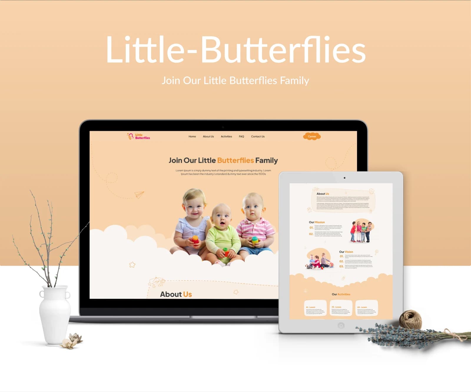
Little Butterflies’ web presentation centers on a family invitation and information about its organization. The supplied layouts use photographs of children, introductory content, and service cards to guide visitors from a first impression toward learning more about the offering.
What we had to solve
Families need an inviting first impression and a straightforward way to learn more. The website uses gentle visual cues without allowing decoration to overwhelm the service information.
What we built
A family-led introduction: Photography and approachable headings establish the subject before the more detailed content.
Services in smaller groups: Cards separate individual information areas so the page can be read in manageable sections.
A visible enquiry route: Contact information and form layouts provide a clear continuation from introductory browsing.
A gentle first step (app): The language-choice screen gives the introduction one focused decision.
An illustrated home (app): Warm cards establish the family context before the more detailed information below.
What it does
Family introduction
A prominent welcome section establishes the audience and organization.
About information
Dedicated content introduces the people and purpose behind the brand.
Service cards
Individual cards break the offering into scannable sections.
Device presentations
Original desktop and tablet mockups show the site’s visual treatment.
Family home
Illustrated cards and daily-information rows introduce the personal workspace.
Language choices
A dedicated entry screen groups the language options shown in the artwork.
Conversation view
The original screen set includes a parent-oriented message and shared-image layout.
Compact navigation
A small navigation area connects the surrounding mobile information screens.
How people use it
The public website introduces the setting before guiding families toward service details and an enquiry.
- 01
Meet the organization
Begin with the family-focused introduction, photography, and short explanation of Little Butterflies.
- 02
Understand the offering
Explore the about sections and service cards to see how the information is organized.
- 03
Take the next step
Reach the contact and enquiry areas after reviewing the organization, services, and supporting content.
Inside Little Butterflies
Peach backgrounds, soft illustrated edges, and rounded content blocks create a gentle visual rhythm. The logo’s bright colors remain small accents, allowing family photography and accessible text sections to lead the page.
Designed for every screen
A family-oriented mobile presentation with language choices, a personal home, daily information, and conversation screens.
Where it is today
A complete website and mobile app for Little Butterflies, designed and built by our in-house team
A content structure for family discovery. Service modules, Public information, Enquiry interface.
Planning a similar product?
Tell us about it and get a scoped plan within one working day.
Get a free consultation
A senior engineer replies within one working day.