Been There.
Case study · Services marketplace
A services marketplace website with skill search, freelancer discovery, and distinct client and freelancer pathways.
- Client
- Been There
- Industry
- Services marketplace
- Timeline
- Website and mobile app
- What we did
- Mobile app development, Web development, UX/UI design
About Been There
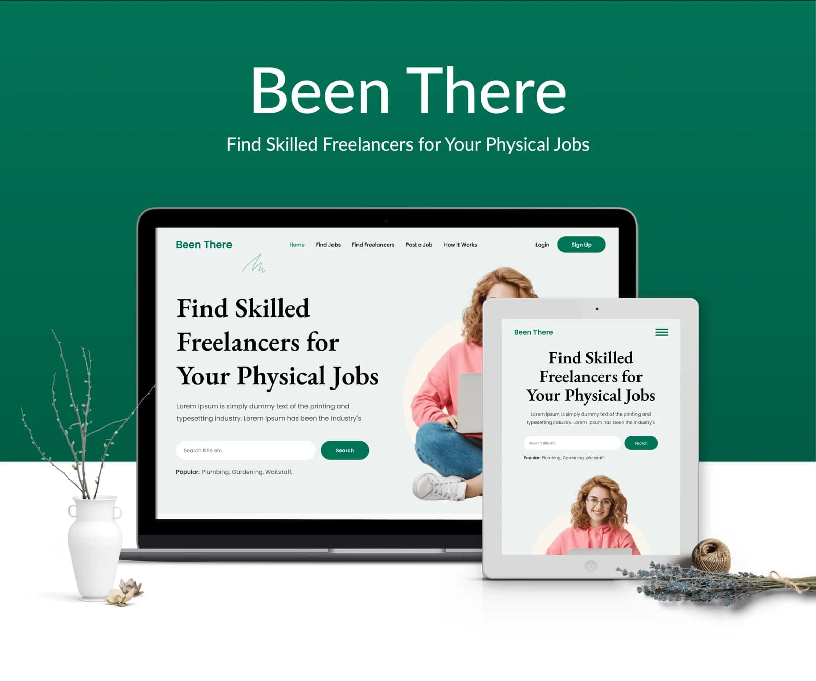
Been There’s web artwork introduces a marketplace for physical jobs. Its opening view combines a skill-search field with a clear product proposition. Navigation distinguishes client and freelancer audiences, while supporting sections introduce the service and the people available through it.
What we had to solve
A services marketplace has to introduce both the task and the person behind it. Been There's layouts link skill discovery with task-entry and conversation screens through one consistent green identity.
What we built
A task-led starting point: Search and service information establish the work context before the more detailed interface.
Contained task entry: Grouped fields divide the job description into smaller input areas.
Conversations beside people: Contact lists and message panels connect identity with the discussion around the work.
Skills with visual distinction (app): Color and short labels separate the different work categories in the opening composition.
A contained account form (app): The registration view keeps input fields in one deliberate vertical sequence.
What it does
Skill search
The opening screen includes a search field for exploring skills or jobs.
Freelancer discovery
The website presents people as the center of the marketplace.
Audience pathways
Navigation distinguishes client and freelancer information.
How-it-works content
A dedicated informational route supports first-time visitors.
Service categories
Color-coded choices introduce different kinds of work.
People discovery
Profiles and portrait imagery support browsing.
Task records
List-based views organize personal work information.
Account navigation
A profile area and compact navigation connect the screens.
How people use it
The website connects finding help with the visible screens for describing work and communicating around it.
- 01
Start with a skill
The public introduction gives skill and job discovery a prominent search-oriented entry.
- 02
Describe the work
The supplied job form groups the information needed to present a task within the marketplace interface.
- 03
Continue the conversation
People lists and message panels provide the communication surfaces shown alongside the work-entry layouts.
Inside Been There
Deep green anchors a light, image-led website. The search action receives a clear position in the hero, while portrait photography connects the marketplace concept to people. Generous spacing gives the interface an approachable service-oriented character.
Designed for every screen
A services-marketplace app presenting job categories, people, task records, and profile information.
Where it is today
A complete website and mobile app for Been There, designed and built by our in-house team
Discovery, task entry, and communication. Skill discovery, Task forms, Conversation panels.
Planning a similar product?
Tell us about it and get a scoped plan within one working day.
Get a free consultation
A senior engineer replies within one working day.