Printlific.
Mobile app · Photo personalization
Printlific’s mobile interface presents photo selection, print-product discovery, and a personalized creation flow.
Create something tangible from a photo.
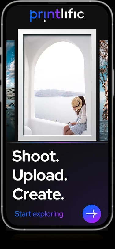
The Printlific mobile artwork pairs a product catalog with image-selection screens and a personal account area. The brand’s visible proposition centers on shooting, uploading, and creating. Its mobile layouts give the photograph a central role in moving toward a personalized print.
What it does
A photo-personalization journey showing product-edge choices, image upload, preview, and a consistent creation action.
Photo selection
Image-based choices introduce the personalization experience.
Product discovery
Print products appear in a visual catalog layout.
Creation entry
Prominent controls lead into the photo-based creation flow.
Personal account
A profile area groups customer information and navigation.
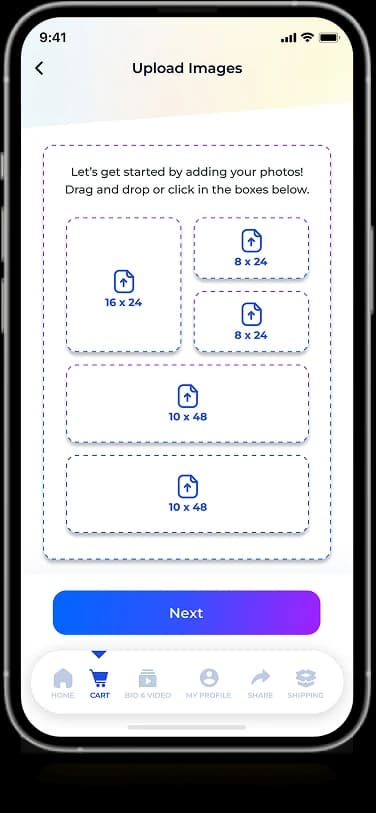
How people use it
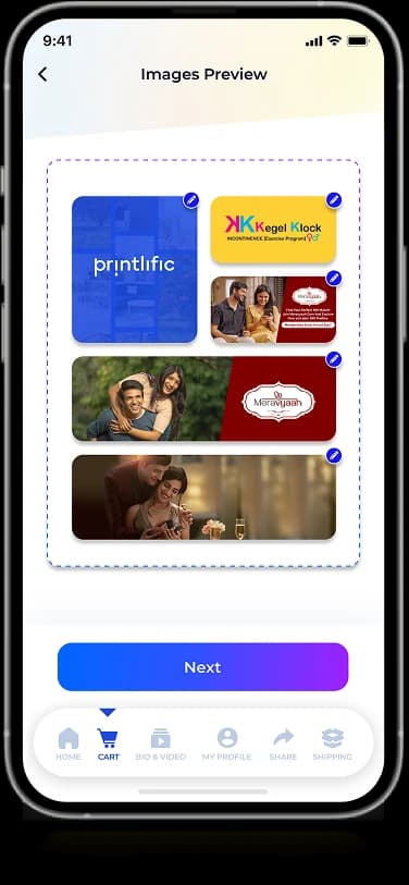
Printlific's mobile screens describe the product visually as a sequence from a print choice to an image preview.
- 01
Choose a product format
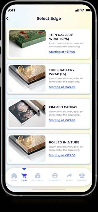
The displayed product-edge options pair a material example with short supporting information.
- 02
Select an image
An upload screen groups the visible image-source choices within a focused selection area.
- 03
Review the preview
The selected-image view provides a separate visual check before the next creation step.
Make a creative sequence feel connected.
Personalization spans several decisions, from the physical format to the image itself. Printlific uses a repeated action position and a consistent light interface to connect the individual steps.
Choices with examples
Product-format imagery helps explain the physical difference between available options.
One image-selection task
The upload view separates selecting an image from browsing the product catalog.
A dedicated preview
A larger image area provides a visual checkpoint within the displayed creation journey.
How it's put together
Design direction
Electric purple and blue create a vivid identity around white product panels. Large image choices and rounded product tiles keep visual content prominent, while short forms and clear actions support the account and creation screens.
Technical perspective
A staged configuration interface.
The screen set separates product choice, image-source selection, and preview into distinct states. It does not establish file-upload infrastructure, print-resolution checks, production fulfillment, or checkout integration beyond the controls shown.
Inside Printlific
Select any screen for a closer look.
Planning something similar?
Creating a personalized product flow? Let's make each decision visible and keep the creative sequence coherent.
Get a free consultation
Tell us what you need. A senior engineer replies within one working day.