Been There.
Mobile app · Local services
A services-marketplace app presenting job categories, people, task records, and profile information.
Find the right skill on a smaller screen.
Been There’s mobile presentation translates the service marketplace into category-led discovery and personal task screens. The supplied artwork shows people, categories, and list-based records. These views complement the web product’s focus on finding freelancers for practical jobs.
What it does
A practical-services app with colorful skill categories, account creation, saved tasks, and people-oriented marketplace content.
Service categories
Color-coded choices introduce different kinds of work.
People discovery
Profiles and portrait imagery support browsing.
Task records
List-based views organize personal work information.
Account navigation
A profile area and compact navigation connect the screens.
How people use it
The mobile screens connect discovering a type of work with the account and task views around it.
- 01
Explore a work category
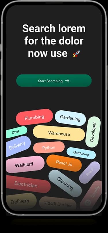
Colorful skill labels give the introductory screen a distinctive route into the marketplace subject.
- 02
Create the account context
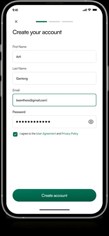
A dedicated form groups the personal information fields shown in the account-creation view.
- 03
Review saved work
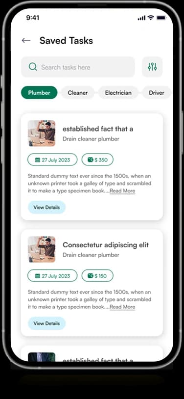
The saved-task screen brings task summaries, people, and compact status information into repeated cards.
Connect a work category with a useful task view.
The appeal of a marketplace introduction differs from the detail needed to review a task. Been There carries its green identity across expressive category discovery and quieter record-based screens.
Skills with visual distinction
Color and short labels separate the different work categories in the opening composition.
A contained account form
The registration view keeps input fields in one deliberate vertical sequence.
Tasks with personal context
Saved cards pair work information with the people shown around the task.
How it's put together
Design direction
Green carries the marketplace identity, with colorful category chips providing a distinct discovery surface. Rounded avatars and white task cards keep people and work information visually separate without fragmenting the mobile experience.
Technical perspective
Category discovery and task records.
The mobile architecture distinguishes an introductory category surface, account creation, and saved-task views. Repeated task cards group identity and work details, while compact navigation connects the surrounding marketplace areas.
Inside Been There
Select any screen for a closer look.
Planning something similar?
Taking a service marketplace into the hand? Let's connect discovery with clear, useful task information.
Get a free consultation
Tell us what you need. A senior engineer replies within one working day.