Little Butterflies.
Mobile app · Family & daily care
A family-oriented mobile presentation with language choices, a personal home, daily information, and conversation screens.
A gentle interface for family routines.
Little Butterflies’ mobile artwork extends the family-focused identity into a personal daily-use interface. The supplied screens include a language-selection step, an illustrated home, daily-information rows, and a parent-oriented conversation. Warm colors and rounded content groups connect these different tasks without making the working screens feel as dense as an administrative dashboard.
What it does
A family-oriented mobile presentation with a personal home, language choices, daily information, and a conversation view.
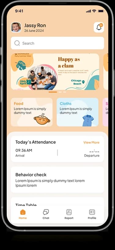
Family home
Illustrated cards and daily-information rows introduce the personal workspace.
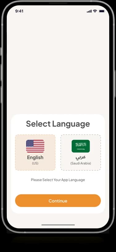
Language choices
A dedicated entry screen groups the language options shown in the artwork.
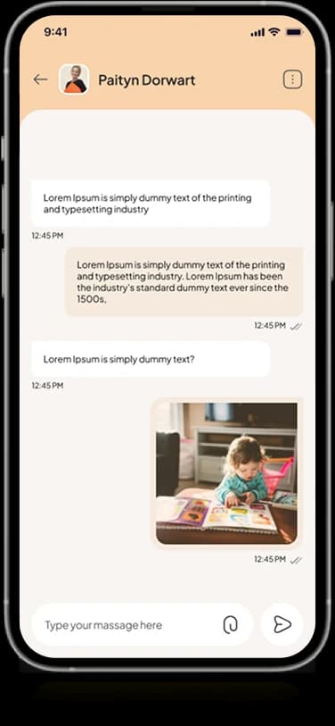
Conversation view
The original screen set includes a parent-oriented message and shared-image layout.
Compact navigation
A small navigation area connects the surrounding mobile information screens.
How people use it
The original screens connect a gentle introduction with the information and communication areas of the family interface.
- 01
Choose a language
A dedicated selection screen introduces the visible language options before continuing into the experience.
- 02
Review the family home
Illustrated cards and daily-information rows organize the personal opening view.
- 03
Read the conversation
The supplied parent-oriented conversation screen provides a separate space for messages and shared imagery.
Keep daily family information approachable.
A family interface combines useful details with a more personal tone. Little Butterflies uses warm colors and recognizable illustrations while keeping lists and conversation content clearly separated.
A gentle first step
The language-choice screen gives the introduction one focused decision.
An illustrated home
Warm cards establish the family context before the more detailed information below.
A distinct conversation area
Messages and shared media occupy their own readable mobile surface.
How it's put together
Design direction
Peach surfaces and orange controls connect the app to the website’s warmer palette. Light backgrounds, illustrated cards, and rounded components create an inviting interface, while labeled rows organize more detailed information.
Technical perspective
Entry choices, daily information, and messages.
The artwork shows a language-selection interface, personal home modules, and a conversation view. It does not establish automatic translation, childcare-record integrations, notification delivery, or a messaging implementation.
Inside Little Butterflies
Select any screen for a closer look.
Planning something similar?
Building a family-facing app? Let's bring clarity and a warm tone to its everyday information.
Get a free consultation
Tell us what you need. A senior engineer replies within one working day.